user@devops:~$ cat README.md
Matplotlib — Data Visualization
# Description
Data visualization project with matplotlib and seaborn using simulated retail store data (MarketPro, 810 transactions). Learn the 8 essential chart types for Data Science: line charts for time trends, bar charts for comparisons, histograms + KDE for distributions, boxplots for outliers, scatter plots for relationships, heatmaps for correlations, pairplots for complete EDA, and multi-chart dashboards. Includes color theory, annotations, and data storytelling concepts.
# Key features
$ Line charts with moving averages for time trends
$ Bar charts and grouped bars for categorical comparisons
$ Histograms with KDE for distribution analysis
$ Boxplots for automatic outlier detection
$ Scatter plots with regression lines for variable relationships
$ Correlation heatmaps and pairplots for complete EDA
$ Multi-chart dashboards with subplots
# Gallery
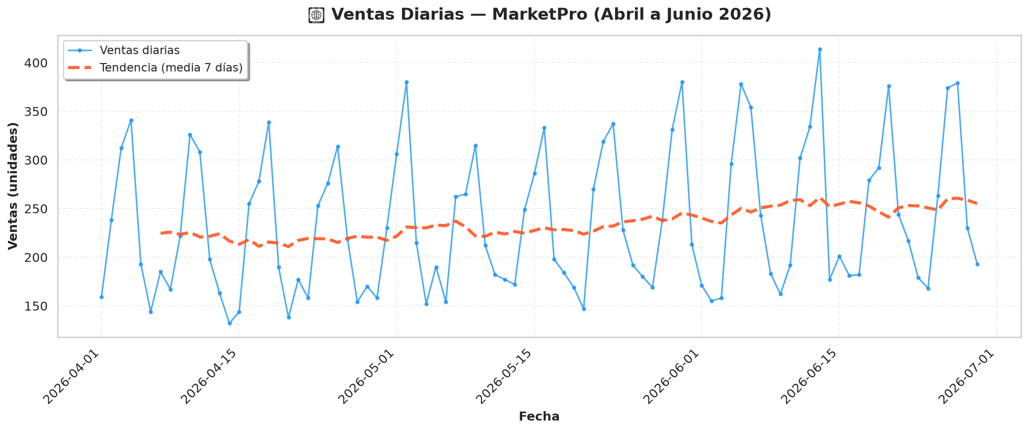
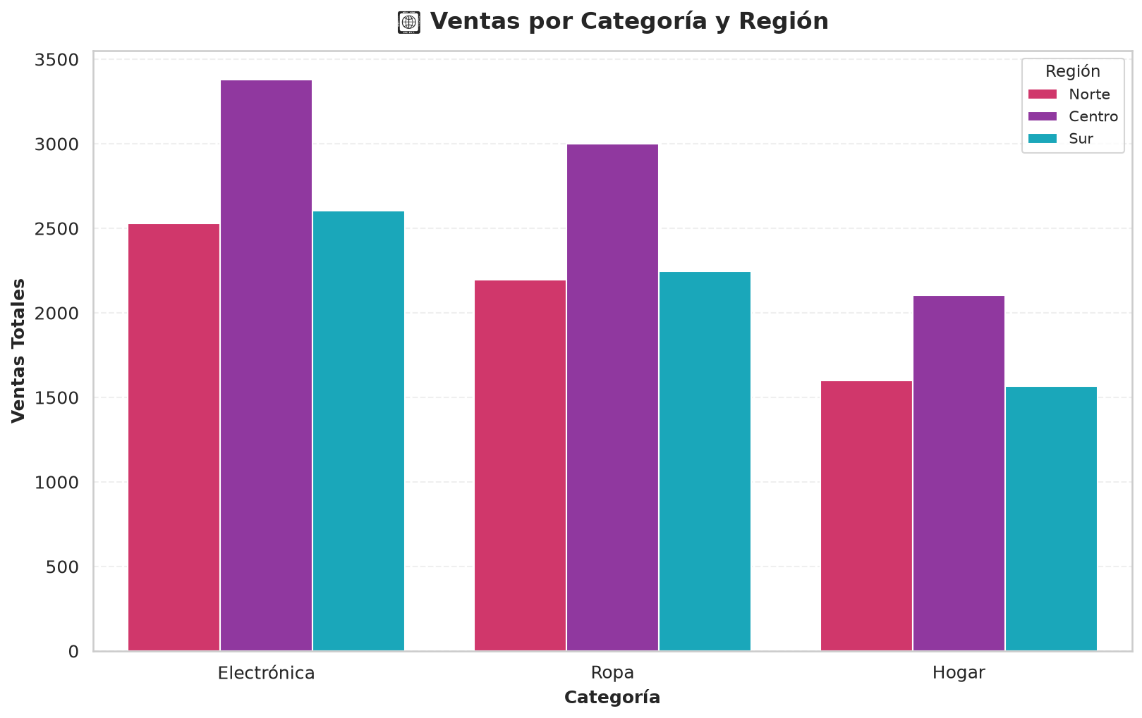
# Technologies used